As a generalist MYP teacher, I cover a number of subjects – humanities based – within the lower middle school grade levels. One of the many advantages to this is that it allows for transdisciplinary learning PYP style. This semester we are making iBook ePortfolios.
Pre-Thinking and Research
The area of research on education eportfolios began about thirty years ago. Helen Barrett is one of those early pioneers and is constantly modifying her theories to keep up with the progress of technology. She speaks a lot about the balance between “Process” and “Product” or “Workplace” and “Showcase”. Its easy for all this to become bigger than Ben Hur so a few decisions where made early on
I decided to separate these two parts with iCloud Apps and/or GoogleDrive being our “Workplace” and an iBook being our divided “Showcase”. Divided in the sense that it does not strive to be our portfolio forever, just simply for this year and that like paper portfolios reflect a specified time and space. I initially tried to workout a solution that would encompass all aspects of learning, process/workplace and product/showcase, but soon discovered that doing this limits the lifetime of the portfolio. There will always be new developments so a portfolio should be a simple/rudimentary solution that can bend with time i.e. file storage. A finished showcase product such as an iBook can be filed away and looked back on as a window to our learning.
Barrett puts forth in her February 2016 article, “Is the Future of Interactive/Reflective/Portfolio Learning in Your Pocket?” that functions of the eportfolio on the “Workplace” side are;
- Capturing & storing evidence of learning – whether in the form of text, images, audio or video can be stored and organized in a tree structure using cloud storage.
- Reflecting – is an essential part of learning for without reflection – “thinking about thinking,” – there is no gain.
- Giving/receiving feedback and collaborating – learning is a social activity and cloud based options allow for collaborative editing (iCloud Apps).
- Planning & setting goals – is an important part of the process of learning and shows how the student is moving toward independence.
- Sharing – at regular points in the learning process, a learner may wish to share their progress with an audience, either real or virtual.
All these functions can be fulfilled successfully with iCloud storage and iCloud Apps, i.e. Pages, Keynote, and Numbers. This is my personal preference because we are an Apple school and iCloud in integrated into the apps. Most of the students also have iPhones which they occasionally use to digitize their work and record learning.
The functions of the “Showcase” side of the portfolio can be summarized as;
- Publish – collating learning experiences into a coherent story, presented professionally considering design principles
- Publicise – sharing the work with whatever audience you wish; this can be limited (school, family, and friends) or unlimited (the world), and can be achieved through social media (a future post).
Design and Layout
After much thought, I decided to share eight templates with my students that they can use for their portfolios. I also decided to strongly recommend, in the interests of continuing of design, that they not change the fonts or basic layout of the pages. The reason for this is that this is another whole area of design that is too big to fit in the time we have for this project. I did however spend a whole double period with them on Creative Commons licensing and ethical media use. I anticipated it would only take twenty minutes of me discussion/demonstration and then another ten of practice but they were surprisingly engaged and actually wanted to know more. In particular there were students interested in the licenses for their own original works.
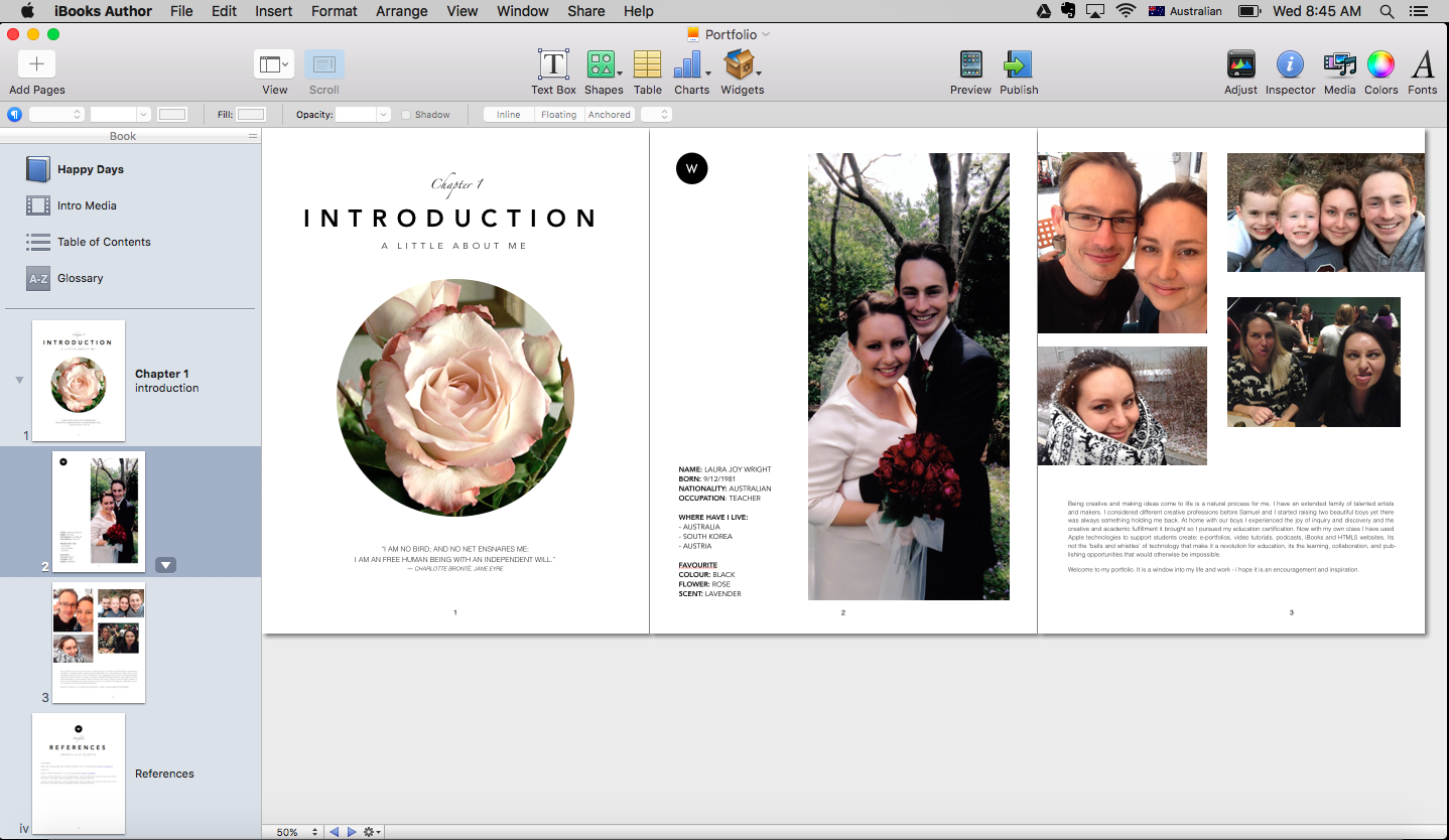
Here is the first stage of the process – teacher created example – cover, introduction chapter, and references chapter.
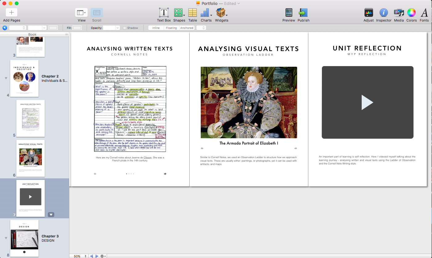
For the next lesson we added another two subject chapters to the portfolio, after the introduction but before the Reference (which will always be last). The first chapter was for Individuals and Societies. We added then added pages called; Cornell Notes, Analysing Written Texts, and Analysing Visual Texts. Each of these pages we inserted a Media Gallery Widget
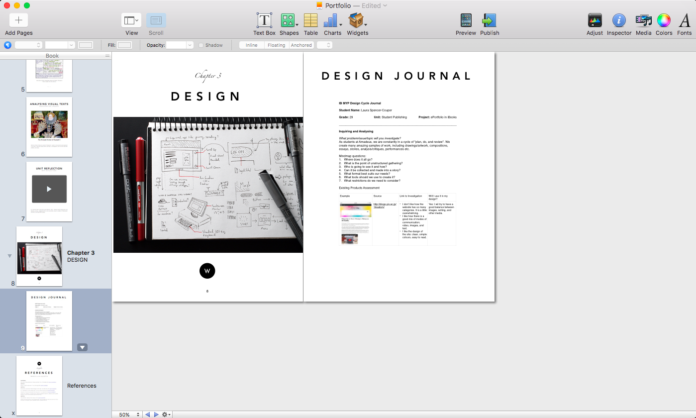
The second chapter was for Design. We added one extra page for the Design Journal – For this I simple inserted single page PDFs into a Media Gallery Widget.
This was my first MYP Design unit. I have to say I am a little disappointed that the “design cycle/process” is so particularly emphasized and not exemplary skill or craft of production. With more practice, I am sure I can simplify/condense the “Inquiring and Analysing” and “Developing Ideas” stages of the process.

